Evaluative Research on a Humanitarian Charity Website
A usability test of Crisis.org.uk's desktop site identified barriers preventing users from effectively supporting the charity’s mission to end homelessness, aiming to enhance perception, engagement, and persuasion among visitors.
Objectives
Improvement of wayfinding
Enhancement of engagement and persuasion of the website
Decluttered and streamlined content design
Tasks
Research Design
Participant Recruitment
Usability Testing
Usability Reporting
Timeline
from March 2023 to April 2023
Problem Statement
Crisis.org.uk's website may lack the clarity, usability, and persuasive design needed to effectively engage users, communicate its mission, and motivate support through donations, volunteering, and advocacy. Usability issues could be hindering the public’s ability to understand and participate in the charity’s social impact efforts.
Research Questions
The degrees of persuasion and engagement of the website for the target audience
Does the website clearly communicate its goal with its target audience?
Does the website motivate its target audience and have a trigger that makes the audience keep engaging with the organization?
The overall user experience of the website
The degrees of ease of use and satisfaction with the user journeys which are closely associated with social actions such as donations that help keep the charity running and supporting people in need of help.
How do users feel while actively engaging with the user journeys?
Does the website allow its target audience to partake in social actions without much effort?
The degrees of comprehensibility and wayfinding while exploring the website's campaigns
Does the website clearly communicate with its target audience and successfullydeliver its messages to them?
Is the target audience aware of what kind of social actions are required to supporthomeless people?
Are they motivated and willing to take action accordingly after reading about acampaign?
Research Findings
Usability Issues
For this study, task-based questions were formulated and two scavenger hunt tasks with scenarios were asked to perform as well.
Combining the think-aloud method with semi-structured interviews helped reveal a wide range of website issues, as participants brought different perspectives even though they followed the same basic script. Letting some choose their own tasks allowed for broader exploration and more varied feedback.
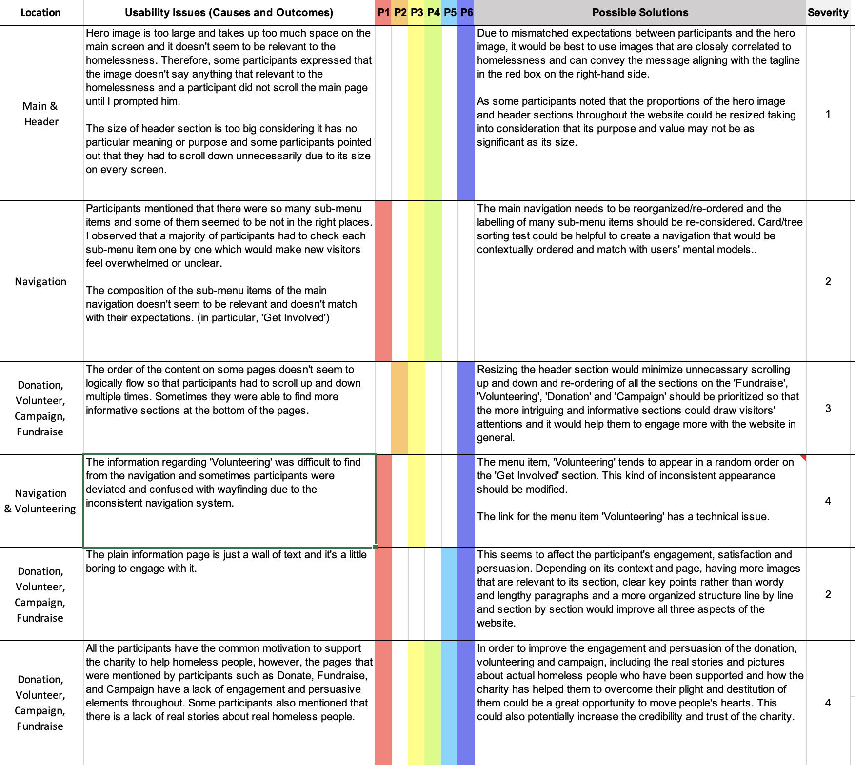
Fig 1. Usability data in a rainbow chart to visualize insights in a structured form
During the deductive approach to categorising data, the context column on the rainbow chart was created to make sure each usability problem was independent and to specify where they belonged, if a couple of usability problems were interdependent or if a usability problem was overarching broad areas of the website.
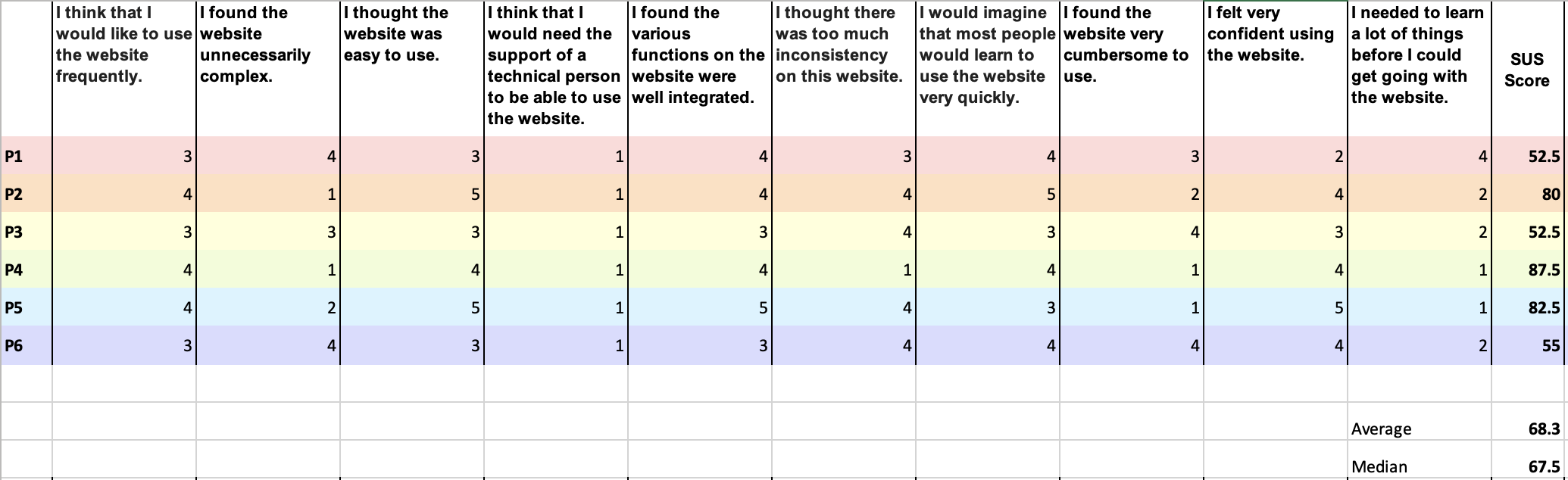
System Usability Scale (SUS) Score
Average score of the SUS
68.3%
Noting that quantitative user testing typically has a 19% margin of error and the average usability difference between websites is 64%, quantitative usability research would not necessarily be as efficient and accurate as expected[Nie*11].
Fig 2. SUS score to quantify participants' responses of the website usability
Due to the nature of the research, quantitative data garnered from the research was not of paramount importance; however, it helped summarize the data of the variation of perception of task experiences.
Recommendations
The main recommendations focused on four key areas:
Improving navigation,
Using clear triggers to spark action, based on Fogg's behaviour model,
Designing content with strong information cues,
Making communication with users more clear and direct.
Rec 1: Wayfinding
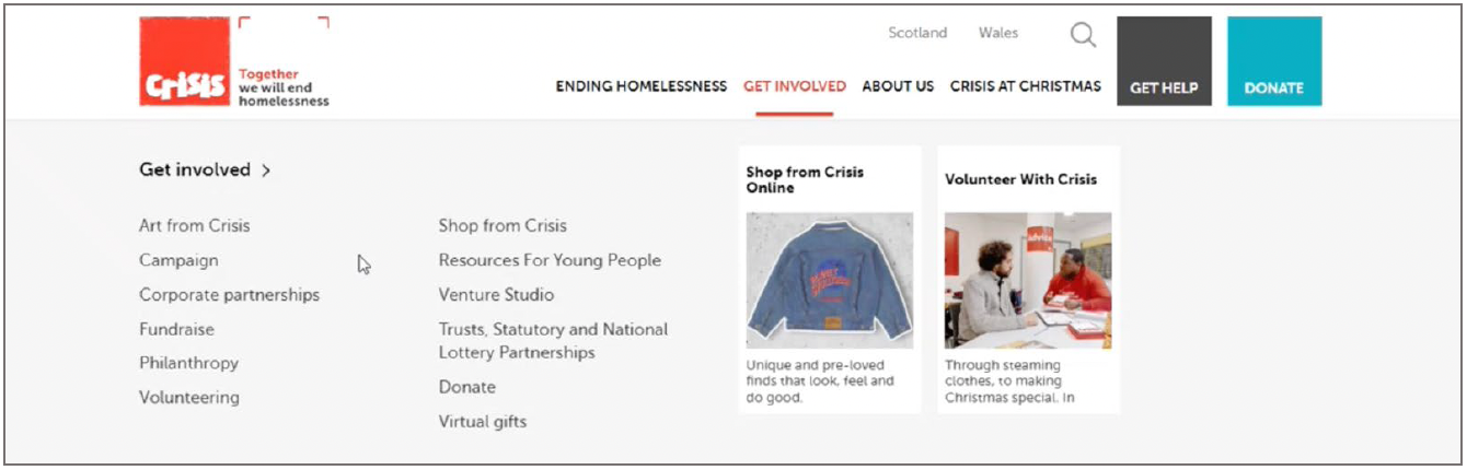
Many users felt overwhelmed by the cluttered submenus under ‘Get Involved’. Clearer grouping and labeling would boost findability and reduce effort. While untested, this stands as a strong design hypothesis for improving navigation.
Fig 3. The appearance of the Volunteering submenu item under the "Get Involved" menu
Design Opportunity #1
Navigation should make the submenu structure clearer so that users can find items more easily and with less effort.
Suggested Navigation
Get Involved
Your support
Donation
About the donation
Donate
Philanthropy
Volunteer
Fundraise
Campaign with us
Other ways to help
Art from Crisis
Shop from Crisis
Virtual gifts
Little helpers
Partnership
Corporate
Trust, Statutory & National lottery
Venture Studio
Design Opportunity #2
Consistent location and design of navigation throughout the website. Multiple subpages have inconsistent navigation systems. Main navigation should be shown on every single page for consistency which helps users navigate the website more easily without deviating.
Design Opportunity #3
Batch filtering, such as "by date" and "by region" to refine the search result to meet users' criteria. Batch filtering can minimize any waiting time for pages to be loaded if a website is slow or if it works on mobile devices considering latency. It would be the best fit for finding a volunteering role and a fundraising event on the Crisis website as the filter options are not too broad and extensive and it has a limited number of criteria [She*16].
Visitors want to see how transparent and trustworthy the charity is — like where donations go. A clear donation page with infographics and an annual report would really help.
Spark
For those less motivated, the site could inspire action by sharing real photos and stories of homeless people and how the charity helps change their lives.
Rec 3: Content Design with Information Scent
Info Scent
Clear, well-organized content with strong info cues helps users quickly find what they're looking for and stay focused on the page's goal.
Optimized information foraging
Infographics and key points rather than long-winded descriptions/articles to optimizethe user experience and efficiency of information foraging.
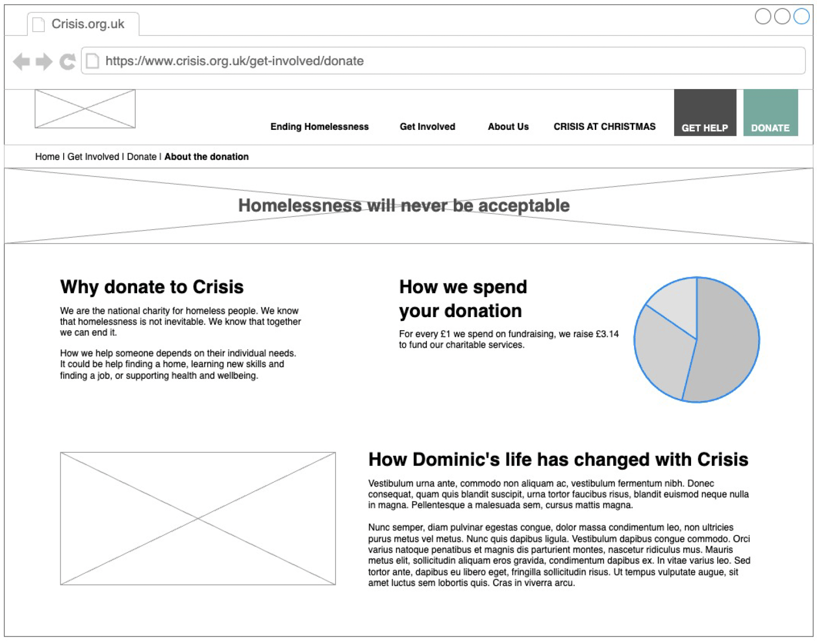
Fig 4. A wireframe for a discrete donation page
The research showed people expect real stories and photos of homeless individuals, showing how the charity has changed their lives. This kind of content builds empathy and motivates support, which is the core goal of the site. Since the 'Donate' button stands out, a clear page on where the money goes would grab attention and likely boost donations. The wireframe includes all key recommendations: better navigation, triggers to inspire action, cleaner content, and clearer communication.
Rec 4: Clear and Effective Communication with the Audience
A clear goal
Some participants felt the site had so much information that it was hard to find what they needed or understand the charity’s purpose. Giving each page a clear info goal would help the site communicate better and work with the other key improvements.
Storytelling
In line with Rec 2, storytelling could draw more people's attention and the credibility ofthe charity could be improved in tandem.